Labels

Thursday 26 April 2012

Question 6


Reflective Evaluation Question 7 Laurence Williamson


In this video I talk about how my skills have improved since the beginning of the course back in september. I talk about how I have learnt about different camera angles and show examples of how I have used them effectively by talking over my first few films that we made when practising for our final evaluated piece. I also talk about my strengths and weakness' during the making of our film, including how I contributed towards the making of the film.

The Exposure Film Poster


Wednesday 25 April 2012

Evaluation Rachael Biggs

This is my final evaluation that I have done. I go through the making of the first film, this is where I learned about contiunity editing. In the first filming my strengths where clear that I could direct and work the camera well, such as white balancing. But my weaknesses from the start of the filming was not good, the camera angle was not aimed right, the camera was shaky but the tripod was used. The shots where shot in college so therefore in the background there is background noise. The rule of thirds did not apply in the very first shoot. The shooting for the final film went well. My strengths for the final filming was I could direct well which i carried through from the very first filming. The other strengths was I could edit the work and add effects such as the zoom out of the title. I decided on the mise-en-scene for the filming, The dark room was used and worked effectively I think that the room and lighting could be a little lighter but we put the character in a white mask so i think this works effectively. In this video I go through the film that.


WARNING! On this I have made an error but cannot change it as it will not let me, but where the random clip of the tripod goes its not ment to go there it is ment to be after i have spoke about continuity. On imovie it is fine and I have uploaded it to blogger and it has changed it.

Rachael evaluation question 6


This is my presentation of the technologies used in the making of our film.

Tuesday 24 April 2012

Question 3


The sample poster will show a key image the name of the film company. The film makers made a sample poster just to advertise the film, then they release the final poster which says when its been released in the cinema. The sample posters are just to get the film known so that people will go watch the film, another way to promote the film will be by trailers. The trailer for amityville horror has released the trailer so it attaracts the audience, the trailer contains parts of the most intrestings bits of the film so that the audience gets drawn in. Lines are used such as 'based on a true story' so it makes you want to watch it even more. The trailers are a great way to promote your film and so if we wanted to do this we could put the trailer on youtube to get views.


This is our film poster that we have created, this has been made by photoshop, as you can see we created the light and then took an image from the film and made it more transparent this gives a great effect. another image from the clip has been taken and that is of the guy, We have made the character also transparent and then added a black and white effect to make it fit more with the genre. We went with the traditional poster and made the writing white and big so that is clear to see and then a slogon has been used saying 'dont look into the light' this is to draw people in and watch the film. Credits are placed at the bottom of the poster with the film website and companys logo. The certificate is also on the bottom to clarify the age.

Friday 16 March 2012

Audience Reviews


question 3 production company logo


We have used this image and edited it to create a background for our Logo. We chose it because it shows shadow and light which is represented in our film. We used the back background as it shows the genre of horror and then the images and patterns around it show physiological and mystery which is the sub-genre of our film. We also added text with our companies name on: Storm Productions. We used the font as it also stands out which is want we want in our opening titles. 


This is our finished company logo and it will represent our film well. 


These logos are off different companys that produced films. As you can see most of the writing is in the middle and is in bold white writing. The thing that the logos all have in common is they have sky in the pictures. Paramount shows you the mountain and then the nice red setting sky, Warner Bros use a nice blue with a light purple clouding in the back. 20th century fox use a the red setting sky in the background. The image in the middle represents the statue of liberty and then the clouds are editing in going from dark to a bright yellow. Dream works use the moon and then the clouds with a little character with a fishing rode sat on the moon. universal use the sky and the stars. All of these logos are well known and you can automatically know what the company is as soon as you see the background. I have tried to create the same thing but giving it a horror like feel. The white in the logo are representing the clouds but by giving them an effect and adding darker colours it fits in with the genre. 

Tuesday 13 March 2012

Filming update

We are planning on filming our title sequence tomorrow afternoon during enrichment. We intend to film our second shoot within the next couple of weeks.

Friday 9 March 2012

Reflective Evaluation Question 3- Laurence Williamson

Distribution is the way in which media institutions get their films seen and promotion of the film. This can be done by using posters and trailers etc.  


Research into Media Institutions


Hammer Films
Hammer Film Productions is a film production company based in the United Kingdom which was founded in 1934 and has made a large amount of horror films over the years including classics such as 'The Curse Of Frankenstein' and 'Dracula'. The company seized producing films in 1980 but returned in 2008 and have since released the highest grossing horror film in the UK for the last 20 years- that being 'The Woman In Black'. 


Here is the trailer for 'The Woman In Black'. This looks very well produced and it is the first film that Daniel Radcliffe has acted the main character in since the final instalment of the Harry Potter series. The trailer uses key clips from the film which partially allow the audience to understand what the film is about but also entices them to then go to the cinema and watch the full film. The voiceover used in the trailer is also very good as it is quite scary with it being a little girl telling a short story about the 'woman in black'.


Here is the films official poster taken from the Hammer Films website. This is very well produced with a good use of images to clearly present that it is a horror film by looking at the big 'haunted house' in the background, the cloaked figure and the gravestone. It is also a very dark poster which looks effective. The poster challenges that of bigger production companies due to its professional look. 

Black and Blue Films
Black and Blue films is one of Britain's leading independent production companies and recently opened in 2007. 


Stalker 

Stalker is one of Black and Blue films' best horror film productions according to reviews. Here is the trailer:


The trailer for this film is good as again it tells part of the story and gives a clear outline of what the film is about. There is also a lot of action shots in the trailer which would attract people to go and watch the film. The music used in the trailer builds to a crescendo to create tension. This all helps sell the film as it makes it more professional and gets into peoples heads to make them want to go and watch the film and find out what happens and how it 
happens.

stalker.jpg

This is the poster for the film. The poster is simple and uses images to introduce the characters, the victim and the threat. By looking at the poster we can tell that the threat is the hooded figure in the background who is dark and shadowed by the light behind him. The victim is the woman on the left with the knife in her hand as she looks scared and is also wearing white which stereotypically, all victims wear to represent innocence and purity. The woman to the right could possibly be either- she looks quite confused and half of her body is light where the other side is dark so it is quite hard to tell what role she plays. The cracks in the poster are effective as they look quite scary. This poster sells the film quite well as it shows all the main characters including the threat and the victim. 

To distribute our film we might look and using small local film festivals to show other people our work. Something like the Bang! film festival in Nottingham would be appropriate as it is held 3 times a year at the independent cinema- the broadway. 


The screen grab below is from a previous students horror film that has been uploaded to youtube. This is a method of distribution as it has 231 views. We can also look at doing this to distribute our horror film.


Below is a screen grab of a youtube search for 'Short Horror Films' and clearly there is also an opportunity of doing it this way as people do search for short horror films and we can tell this by looking at the different amount of large views each video has.


Here is the poster for our film we made. We made it using photoshop and by finding man image on google of a 'light at the end of a path' and by selecting an image of our character in our film and layering him on top of the background image. We also made him slightly transparent to give the ghostly/horror effect. We then selected an image of the characters face when he becomes possessed and put it inside the light so it is only just visible but is very effective and unexpected. For the text, we used our names and templates from an existing film poster to get the other text. We then put the film certificate on as this is what most other film posters have on them. Finally we put the title and created a slogan of 'Don't look into the light' as most horror films seem to have a small slogan like that. 


Friday 24 February 2012

Our film so far


Rachael's Comments:  

Are your shots steady?
steady shots where filmed using the tripod so they was still, but when we used the dolly, the shots became a little shaky, therefore when we intend to not use a dolly in the second shoot.
Are they well framed? Rule of thirds? Do you have too much/little head room or lead room?
The shots were framed well as we used the rules of 3rd. Also shooting the shots several times and then adjusting if it is needed. 

Do you have a variety of well framed shots?
There are a variety of well framed shots in our film. 

Have you included intresting angles? 
 one angle used is a shot where he is walking towards the door and the camera is following him from the front. 

Have you included a large number of close ups?
There are a few close up shots, but we intend to do more when it comes to the second shoot. 

Editing

Have you achieved contiuity editing? Or does it jump? 
I think the continuity editing doesn't jump. There is one part of the film where you can see a tripod in the reflection of the glass, a wire in the back of the shot. A light is in the back of the shot in one of them, therefore we will need to refilm again. 

Does the editing build pace and tension? 
As we have not completed much editing as of yet, we intend to ensure that when we do edit it, it will create tension and build pace. 

Do you have well used mise-en-scene?
we have used the house as a setting, as films such as paranormal activity have used this setting too.
Does the setting create fear? Have you used this well?
The setting does create tention as the electricity goes off and the tv goes fussy and makes a noice.
Do you have appropriate props? Do they create fear?
The only props used are the Tv and thats when you hear that there is a noice coming from the tv.
Have you utilised the lighting to create fear?
Yes, the main threat and source of all the problems is a 'light', so we hope it creates fear.
Are the colours appropriate to your sub-genre?
We have used dark colours to show that this a horror.
Is the characters performance convincing?
The characters performance is convicing as he uses facial expressions and looks confused so this makes the audience think something is there, then at the end he gets possesed the actor got a clear sence of what we was going for, and took that roll well.

Have you chose a suitable character?
The characters age fits in with our target audience range.
Do they conform the sterotype of the threat/victim?
No as he is a male and normally the threat/victim is normally a women, but as he is on his own we decided to go for a young male who turns into the threat.


Laurence's Comments:

Camera and Framing

Are your shots steady?
Most of the shots are steady due to the use of a tripod, but when we used the dolly, the shots became a little shaky, therefore when we intend to not use a dolly in the second shoot.

Are they well framed? Rule of thirds? Do you have too much/little head room or lead room?
I believe that the shots are well framed as we ensured that we followed the rules by shooting the shot several times and adjusting if need be. 

Do you have a variety of well framed shots?
There are a variety of well framed shots in our film

Have you included intresting angles? 
We have used some interesting angles, one of which being the shot where he is walking towards the door and the camera is following him from the front. 

Have you included a large number of close ups?
There are a few close up shots, but we intend to do more when it comes to the second shoot. 

Editing

Have you achieved contiuity editing? Or does it jump? 
I believe we have, so far, achieved good continuity editing and it doesn't jump. There is one part of the film where I am clearly visible in the background and this has caused us to have to do a second shoot. 

Does the editing build pace and tension? 
As we have not completed much editing as of yet, we intend to ensure that when we do edit it, it will create tension and build pace. 

Mise En Scene

Do you have well used mise en scene? 


Does the setting create fear? Have you used this well? 


Do you have appropriate props? Do they create fear? 


Have you utilised the lighting to create fear? 


Are the colours appropiate to your sub-genre? 


Have you choose a suitable character? Do they conform the sterotype of the threat/victem? 


Is the characters performance convincing?? 


Peter's Comments:

Technical Areas:

Camera and Framing:

Are your shots steady?
Most are, however when we used the dolly a lot of the shots were moving slightly or not in the right place. On the second shoot we will stick to using the tripod for all the stationary shots.
Are they well framed? Rule of thirds? Do you have too much/little head room or lead room?
The shots are all well framed, and follow all the rules.
Have you included intresting angles? 
Yes. Yes we have.
Have you included a large number of close ups?
We haven't got that many close up's, however we intend to add more on the second shoot.

Editing:

Have you achieved contiuity editing?
Yes, we have achieved continuity as it doesn't jump and it flows well. There was one part however, where Laurence was just stood plain in the background, so we will have to film that part again.
Does the editing build pace and tension?
We have not finished editing the whole of our film yet, but we hope to achieve this.

Mise en scene:

Do you have well used mise-en-scene? 
Yes, we do.
Does the setting create fear? Have you used this well? 
It's set in the victims home so the audience can relate to it. When something bad happens, like the lights going out, the audience get more scared.
Do you have appropriate props? Do they create fear? 
There are no props.
Have you utilised the lighting to create fear? 
Yes, the main threat and source of all the problems is a 'light', so we hope it creates fear.
Are the colours appropriate to your sub-genre? 
Yes. There is
Is the characters performance convincing?
Yes.mainly just normal lights used in the house to give a sense of normality, however the bright white light outside relates to the psychological side.

Have you chose a suitable character?
Yes.
Do they conform the sterotype of the threat/victim?
Yes.


Reflective Evaluation Questions 4&5- Laurence Williamson


Paranormal Activity- 15


The certificate for ‘paranormal activity’ is a 15. From looking at the user ratings to the left, taken from the IMDb website, we can see that the film was rated by a large male audience aged 18-29. We can see this by 54,121 of the votes are by this group. This could be because it has been portrayed as very scary and is supposed to mess with your head and stereotypically, females would be more reluctant to watching this compared to males.


1408- 15


The certificate for ‘1408’ is a 15. From looking at the user ratings taken from the IMDb website, we can see that the film was again rated by a large male audience aged 18-29. We can see this because there are 56,106 votes from this audience for this film. This shows that the film mostly appeals to males. This could be because the main character in the film is male and generally speaking, males tend to prefer horror films compared to females.


The Sixth Sense- 15


 The certificate for ‘The Sixth Sense’ is a 15. From looking at the user ratings taken from the IMDb website, we can see that the film was again rated by a very large male audience aged 18-29. We can see this because there are 143,397 votes by 18-29 year old males and 213,270 votes by males in general.


The Haunting In Connecticut- 15


The certificate for ‘The Haunting in Connecticut’ is a 15. From looking at the user ratings taken from the IMDb website, we can see that the film was again rated by a large male audience aged 18-29. We can see this because there are 11,419 votes by this audience for this film.


The Omen- 15


The certificate for ‘The Omen’ is a 15. From looking at the user ratings taken from the IMDb website, we can see that the film was again rated by a large male audience aged 18-29. We can see this because there are 15,427 votes by this audience for this film.

The Content of Film Certificates


By looking at the certificates for the films above, I believe that it is right to rate our film as a 15 as it does contain some frightening sequences which are not allowed in films rated below a 15. Below is a lost of content that is allowed in a film rated 15. I don’t think we can rate it any higher as we can only make it as scary as possible without a budget where as most 18 films have a high budget.


15 –
Suitable only for 15 years and over
No one younger than 15 may see a ‘15’ film in a cinema. No one younger than 15 may rent or buy a ‘15’ rated video work.


Discrimination
The work as a whole must not endorse discriminatory language or behaviour.
Drugs
Drug taking may be shown but the film as a whole must not promote or encourage drug misuse. The misuse of easily accessible and highly dangerous substances (for example, aerosols or solvents) is unlikely to be acceptable.
Horror
Strong threat and menace are permitted unless sadistic or sexualised.
Imitable behaviour
Dangerous behaviour (for example, hanging, suicide and self-harming) should not dwell on detail which could be copied. Easily accessible weapons should not be glamorised.
Language
There may be frequent use of strong language. The strongest terms may be acceptable if justified by the context. Aggressive or repeated use of the strongest language is unlikely to be acceptable.
Nudity
Nudity may be allowed in a sexual context but without strong detail. There are no constraints on nudity in a non-sexual or educational context.
Sex
Sexual activity may be portrayed without strong detail. There may be strong verbal references to sexual behaviour, but the strongest references are unlikely to be acceptable unless justified by context. Works whose primary purpose is sexual arousal or stimulation are unlikely to be acceptable.
Theme
No theme is prohibited, provided the treatment is appropriate for 15 year olds.
Violence
Violence may be strong but should not dwell on the infliction of pain or injury. The strongest gory images are unlikely to be acceptable. Strong sadistic or sexualised violence is also unlikely to be acceptable.
There may be detailed verbal references to sexual violence but any portrayal of sexual violence must be discreet and have a strong contextual justification.

Thursday 23 February 2012

Reflective Evaluation Question 2- Laurence Williamson


Representations are based upon stereotypes and what we expect to see when watching a film for example. There is a wide range of stereotypes that we easily relate to different social groups and genders. Below are clips from different films that use stereotypes that relate to my film so I can further understand representation. 


1. 
This is the trailer for the film 'The Machinist'. By looking at the trailer it is obvious that the victim in the film is the very thin male, and this goes against stereotypical horror film victims as usually it is a female victim. He also looks as though he is in his 30's which is quite old for a victim in a horror film as usually they are fairly young. The male looks like he belongs to the working class social group as he works in a factory and has quite a shabby house/apartment which is quite common for victims although in some cases, the victims are quite well off and live in larger houses due to them being fairly young and possibly having wealthy parents. By watching the trailer, the threat is shown as the male who appears when 'the storm' arrives and then victim keeps seeing him in his workplace doing threatening gestures towards the victim like the classic 'throat slit'. The threat seems to live the same lifestyle as the victim, being working class as he works in the same factory and wears the same clothing as the victim. As the trailer continues it becomes apparent than none of his colleagues can see the threat possibly suggesting that the male victim is imagining that the threat is there meaning that the threat could actually be the victim himself. In conclusion , in this film the stereotypes of a psychological horror are not followed as the victim is firstly male which isn't very common at all and secondly he is fairly old which also isn't very common. Also, (without watching the film) the trailer suggests that the victim isn't physical it is actually mental, being in his mind as he is imagining it which is quite common in psychological horrors. 


This is the trailer for the film, "The Haunting in Connecticut". The victim is a male teenager which stereotypically is the correct age for a victim but the wrong gender as females are usually the victim. The victims weakness is instantly recognised in the film as he head a severe form of cancer which contributes to his vulnerability as the audience are supposed to feel sympathetic for the male. This creates fear in the audience as he already has something bad happening to him and it is obvious that something greater is going to happen to him. The threat in this film isn't really seen therefore cannot be placed in any social group as it is all in his mind. Although, in this trailer it seems to suggest that possible threats could be the ghosts seen but by watching the film the audience realises that the threat isn't physical it is mental. In conclusion the stereotypes of a psychological horror are partially followed as the victim is a teenager but is a male. Also, the threat is in his mind which follows stereotypes for psychological horrors. 


2. 
Here is a test shot of our actor wearing the make up we used on him to film. We chose this make up and costume to make him look demonic yet innocent with the white shirt on as stereotypically white clothing makes victims seem innocent and pure. The story line for our film revolves around a 'light' which then causes the victim to become possessed and this is shown by using make up as shown above. In relation to conventions our story follows the conventions of a psychological horror by using an innocent yet vulnerable victim and some sort of unusual threat being the light.


3. A sequence in our film that represents age and gender is the opening scene of our film where the character is sat on the sofa watching the film. This represents teenage males as they are stereotypically lazy and just lounge around not doing a lot. This is what is shown in our character. Compared to an existing film this is generally the same way teenage males are represented. We had some audience feedback from other members of our class and below is a worldle of some of the key words that they used in their feedback reviews. 


Reflective Evaluation Question 1- Laurence Williamson

I have chosen the images below as inspiration for our psychological film. I feel that each image clearly represents different conventions from the psychological film sub-genre, and some of which we plan to use in our film.


Logo from an existing film
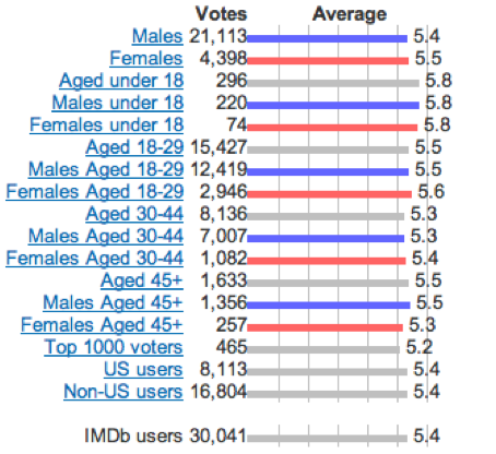
This is the Lionsgate logo which appears in the opening title sequences of their horror films. Looking at the colours used in the background, being black and red, it shows that they are possibly trying to recreate fire by colouring the clouds different shades of red in the background, this could also be trying to create an image of hell. I also like the font of Lionsgate as it stands out with it being fairly large and bold and being coloured with what looks like dirty metal. This is a quite inspiring         
                                                                                      design for our opening logo as it looks quite 
                                                                                         demonic which is what our film is all about. 


Here is the logo for our film. The production company is called 'Storm Productions' and we tried to recreate the storm feeling by using the 'damaged' background' with lightning bolts through it. We also recreated the storm feel by finding a font with what looks like debris coming off it. This is effective as the image relates to the name of the production company which is good as well as it looking quite scary to make it look like a horror production company. 


Title logo from an existing film

This is the title for the film 'The Ring'. I like the design of this logo as it links to the concept of our film quite well with the idea of the light being a threat, I understand that light isn't the threat in the film 'The Ring' but the idea is shown in the logo. I like how the light is coming from behind as it is hidden or covered. I also like how the light begins bright from behind and gradually fades out. The text is also good as it is very simple and it seems as though it has been cut out from the black circle to allow the light to pass through the shape of the letter. This is an idea I would be interested in using for our film logo as again it is primarily what our film is about. 


This is the title for our film. I really like this because it reflects the name and concept of the film by using the light in the background and it being bright in the middle and gently fading as it expands outwards. The light has also been manipulated using Photoshop to add effects such as exposure just to make it a little more effective. The font used is also very simple but the text is placed well above and below the light to allow the light to actually be seen properly. As you can tell we were inspired by 'The Ring's logo by using simple font and some sort of light. 


Image showing sub-genre

This is an image of a scene in the film '1408' which clearly shows the Psychological sub-genre as the image is quite eerie and makes you wonder what is happening. The image relates to our film by using the light to present something. The light in this image is being used to draw attention to something, being the little girl who looks quite ghostly and the light adds to this effect. The girl is also in white which shows purity and innocence whereas 
the man is in dark clothing and on the darker side of the room which could show that he is vulnerable. This is something we will look at using in our film as costume is a very important element of setting the scene. 


This is a shot from our film where the psychological sub genre is shown by again being quite eerie as it makes the audience wonder what the light is that has caused the house's electricity to cut out. It also shows the character as being quite vulnerable as he looks fairly scared as he doesn't know what the light is either. By using the light through the window shows that the character has only got a certain level of protection before it could possibly threaten him. 


Image establishing character

This is also an image from the film 'The Ring' which establishes character. The image directly links to our film as the character becomes visibly possessed by using make up editing to show this and this is what has happened to the girl in the picture. We will also be using make up to show that the character has become possessed. The girl also looks very evil and is shown by her staring directly into the camera which creates more fear within the audience, this is something that I think as a group we should look at doing as it is a very good technique to create fear. 


This is a shot from our film establishing character as it is what the opening scene is; a close up of his face to introduce him. We tried to make him look already vulnerable by him being alone watching a film, and you can tell he looks a little nervous/scared by him biting his nails which is a good action to use to show the audience that a character could be a little scared. 


Image showing misé-en-scene
This image is from '1408' and shows good misé-en-scene as the camera is at a high angle which is showing that the character does not have much power in the shot. The camera is also looking directly at the character through the hole of the noose that is a prop used to show a possible suicide threat. The costume he is wearing shows that he doesn't really know what is happening as he is wearing a hawaiian shirt which is typically worn when having a good time but by looking at this image is shows that it obviously isn't anything good. We will try and use something like this in our film by directly establishing a threat and in our film it will be the light. 


This is a shot from our film which shows good misé-en-scene by showing the character, the victim, in the garden walking towards the light behind the garage, which is the threat. With this also being shot at night it gives it more of a scary feel as seen in other popular horror films; everything bad seems to happen at night as victims least expect something bad to happen but it is even worse when it is at night.


4 key images from existing films
This image is very disturbing, which is what psychological films are supposed to do to the audience. It shows the character looking very ill and quite crazy which could represent him as being possessed. This is something we intend to do in our film, show our character as being possessed by using body language and make up. 


This is an image from paranormal activity 2 showing one of the characters alone in a room looking vulnerable which is what we want to try and do in our film. By doing this it creates tension as no-one is talking therefore it is only the background noise or music that can be heard.


This image is from 'The Ring' and shows the character looking directly into the threat, this is something we are looking at doing in our film. It creates extreme tension and fear within the audience as they expect something bad to happen straight after. 


This is a good image from paranormal activity 2 as it shows the threat being possessed by the demon. This is something we are looking at doing in our film as it is effective and looks good to show the possessed character in a close shot. 


4 key images from our film


This image from our film is good because as said above we want to get the victim to look directly at the threat and this is what we have done here. This is effective as you can see by the characters body language that he feels scared, confused and threatened by the light, which is what we were going for in this shot.


This is a good key image from our film as it shows the victim looking scared as he tries to find out what it was that he just saw out of the window. It shows him alone and the camera angle makes it seem that he has power, at least that is what he wants to think but actually he is about to become possessed. 


This image shows our victim being threatened by the threat as he is clinging onto the wall for protection after he has approached the light. This creates tension and fear within the audience as no one knows what is going to happen next. 


This image is taken from the very end of our film when the victim has finally become possessed by the light. We used make up to make his face seem possessed by darkening his eyes and making his face look dirty and bruised. The way his eyes are looking into his head are also effective as it adds to the look we were trying to create of him being possessed.


INSERT 4 KEY IMAGES HERE